Art On The Internet: A New Medium Crates New Depths
“Perhaps the waves are saying: remember your dreams. Remember your dreams. Remember your dreams.” –Gregory Colbert
The World Wide Web is continually growing in ease of use as well as daily updating the type of information that is available to the millions that use it. In fact to many, the internet has become a necessity in every day life. For some, loss of internet access is a kin to a college student's loss of their cellular phone. Similarly, it appears the number of people who are using the internet are growing themselves. According to a 2003 PEW Internet and American Life Project report, “more than 53 million American adults or 44% of adult Internet users have used the Internet to publish their thoughts, respond to others, post pictures, share files and otherwise contribute to the explosion of content available online.” Since then, the numbers have more than likely gone up. The personal responsibility with writing a blog or managing a website is no longer just a silly past time, instead the internet is a forum where the entire world can access information regardless of time zone and even award winning scholars post their own thoughts for anyone to see. It is quite obvious that the internet is a suitable home for open discussion, written word, photographic displays as well as encyclopedic wells of information and home pages dedicated to giving people basic, though easily accessed information about travel, movie times, and weather forecasting. The access to music and movie clips is unparalleled. The internet has even begun controversies as well as huge law suits over what information the people should or should not be able to access and if they should be able to access it for free. This is evidence enough to state that the internet is quite a powerful, society changing tool. Musicians and young movie makers have a new venue to voice their art and showcase their talents. However, the world of visual art has generally been one best left on display and in museums. That is, until now.
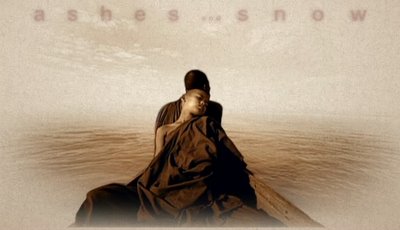
The Ashes and Snow website is a breathtaking one. Not only is the website inventive and original but it also successfully conveys the feelings of this extraordinary exhibit so that even those of us sitting at home can experience a little piece of this world. The Internet has been a place where few art lovers claim a home or find a new talent. In this case, The artist, Gregory Colbert, has used the Internet to its fullest capacity and through this new venue has mirrored his message that was once only visible by those in the right place at the right time and transformed it into a piece of art visible by anyone at any time in a relevant and appropriate way. A few new doors of cyberspace are officially open.
The Ashes and Snow Exhibit is quite a sensory experience in itsel f. The Nomadic Museum that has housed this work from Venice to New York to Santa Monica is a piece of art in itself designed by architect Shigeru Ban and helps create a feeling of organic spontaneity that is instilled in the exhibit. The artist, Gregory Colbert created the exhibit using photography, audio, video and written word. Colbert's work, housed in a museum that is rebuilt at each new location and made of recyclable materials, depicts the intrinsic sameness that animals and humans share and challenges our ability to so easily forget where we came from. To do this, Colbert set off across the world to capture images of animals and humans together, using footage of wild animals as well as footage of animals that have been habituated to human contact. There is no disclaimer on the website that no animals were harmed or forcibly controlled to perform, however it does not seem the message would be the same if those means had been used. Colbert is said to have spent months with the animals gaining their trust and is quoted on the website “I am working towards rediscovering the common ground that once existed when people lived in harmony with animals.”
Though this website was a 2006 Web Award Arts Standard of Excellence winner I will be referring to the more extensive judging criteria of the Webby Awards as well as some of the rules of the Web Style Guide in order to discuss why the Site deserves the acclaim. According to the Webby Awards, “Good content takes a stand. It has a voice, a point of view. It may be informative, useful, or funny but it always leaves you wanting more.” This is certainly true of the Ashes and Snow website, you definitely want more. Colbert is quoted on the website: “I am working towards rediscovering the common ground that once existed when people lived in harmony with animals.” The content of the website is made up of the photographs, video clips, soundtrack and vision of th e artist as well as the bookshop where you can buy prints of the work in beautifully bound editions as well as the DVD of the film and the book of letters that made up the written portion of the exhibit.
Part of what makes the exhibit so exhilarating is that it seems to have a life of its own. This is certainly no coincidence as it is a celebration of life itself. “When you look into the amber eye of an elephant, you may have the feeling he knows something that we once knew. Elephants remind us of the things that we thought we forgot.” Colbert infuses every step of the way with animal imagery that suggests a world overlooked by the average eye. Since Colbert has been working on this project since 2002, it makes sense that there are worlds and dimensions to the exhibit that may go undiscovered by most observers and it is clear that one visit to the New York installation is not seeing all there is to see. As you look through the entire website new images pop up that may have been shown in Santa Monica, though not in New York or Venice and vice versa. For improvements sake, there is one problem with the content of the website and that is that it is a little hard to find concrete information on the artists and how he collected his works. It would be nice to know a little more but too much could really ruin the fluidity of the website and the poetry of its design.
For the purpose of this analysis I am going to focus mainly on the enhanced version of the website, though there is a version for computer users who lack the correct programs.(Most of the links direct you to the non-enhanced version.) According to the Webby Awards judging criteria “Good navigation gets you where you want to go quickly and offers easy access to the breadth and depth of the site's content.” Ashes and Snow.org is this but so much more. The structure and navigation of this website are poetic. As you enter the website, you are engulfed by the beautiful soundtrack from the movie that is not your average Enya-type nature music that instills some sort of clichéd image of life. Instead these simple, but beautiful pieces of music really get at the heart of what it means to see human beings as animals, what it means to view this reality with a sense of acceptance and joy. As you first enter the site you are hit by music and animation as the navigation bar and title melt onto screen one of two animations appear. Either of a boy lit by sun, a bird's wings flapping behind him as though they were his own or the image of two people in a boat, slowly out of the water come towering the elephants as they move by the boat and out of sight. All the navigation options are all in the spirit of the art itsel f. Explore, Vision, Exhibition, Codex, and Bookstore. The word explore at the top of the page is like an invitation to the unknown and that is what is so brilliant about the design of this site. What you explore will never be the same each time around. The Web Style Guide sites that in a good website "important elements are emphasized and content is organized logically and predictably." However, it is in part the lack of predictability that makes this site so unique. When you are shown your first image it explains simply “Explore with your mouse. Click to Enter” and depicts how this will get you around this portion of the site. Little thumbnails of pictures pop up randomly when you move your cursor around, but there does not seem to be any sort of order to this chaos because if you bring your mouse back to the same position it won’t necessarily be the same picture. However, other times if you move your mouse from one place to another you’ll see a trail of thumbnails of the
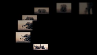 same picture. Once you click to see a new picture there are a few things that could happen. Maybe you will be brought right to a new picture, but other times you will be brought to a video clip from the movie and yet other times this click will be accompanied by an audio quote. Little excerpts of poetry such as “When my house burned down. When my house burned down. I could see the moon much clearer.” Or “The whales do not sing. The Whales do not sing because they have an answer. They sing because they have a song.”
Once exploration is finished for a moment (for it will never reall y be finished) One can "X" out of that portion and be brought back to the main screen. Once you visit a new portion of the site the navigation bar sits floating at the top left hand corner but slightly faded so as to become transparent and ignorable. However, once the viewer wants to utilize the navigation bar again, they simply need to place the mouse over it and it will appear bigger and darker once again. This is key because it makes the site so easy to navigate but does not take away from the mystery and beauty.
The Webby Awards say that “Good visual design is high quality, appropriate, and relevant for the audience and the message it is supporting. “ Well it seems almost foolish to even bother defending this aspect of the site, as the visuals of Colbert are nothing short of breathtaking. The work of this artist, the elephants, whales; cheetahs, tortoises and people alike are the visual design. They as well as the papery like background used for the pages brought in for the “business side,” such as pages dedicated to the artist and the project itself, create the world of mystery, of fantasy and of living reality to life. Even the papery background invokes the “one-with-nature” feeling that Colbert infuses into everything that is produced from this exhibition including the beautifully bound books that hold prints of the artwork and the book of letters that is bound in the same way. Very simple. Very primitive. Very elegant. Similarly it is most impressive that such a complex website seems to have every link in tact, every page loads quickly. A disappointed customer will exist only as the sad patron who does not have the appropriate plug-in in order to view the advanced version of the website.
It seems that as a whole, this site is more than just another stop in cyber space. It really has created its very own little niche in the art world where art has fused multimedia, fast paced imagery, mass accessibility and a sense of interactivity into one work. The entire experience of this site has a feeling of mystery and the viewer is not simply just a viewer and critic. With every click of the mouse as you explore the exhibit you make choices that lead you to new pictures every time. Similarly the website gives an eerie feeling that the viewer has sole rule over the world. The world of Ashes and Snow lives and dies with the viewer. If you watch it, it lives and moves and changes and grows. “If you come at this moment/ your minutes will become hours/ your hours will become days/ and your days will become a lifetime.” Poetry like this lines your journey and adds to this unshakable feeling and creates a sense of awe. One more click- Just one more click and who knows what will happen next.
The Web Style Guide mentions that "Most Web pages don't fit completely on a standard  office display monitor (800 x 600 pixels), and so there is almost always a part of the page that the user cannot see:" indicating that in most web sites you invariably have to scroll down on your browser. However, this website has even taken that into account. Instead of making the viewer scroll down on the cumputer's browser, this site includes its own set of scroll bars within any type of textual interface so all the scrolling is done within the website itself. This makes it a bit easier to navigate as well as being visually pleasing.
The reason why this website works so well is because there is a sense of reality that butts heads with a fantasy land, or a land that maybe once was. A land some of us are striving to return to. However, it is also a land that can not really be regained so easily and there are some worries about this entire exhibit. Allegedly Colbert spent months gaining the trust of these animals, swimming with whales and communing with Elephants. However, there is a certain sense of danger in allowing wild animals like these to become comfortable with Humans. Many of 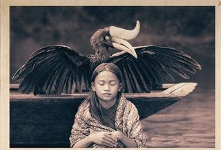 these animals probably already are as they face humans every day of their lives. It is not inherently evil to teach them to trust. However, there is a theory of thought that any intrusive interactions like this will only further the damage that could happen to these animals, especially if they are free living ones. However, there is a lot to be said for the educational experience that this amazing and timeless exhibit holds. It is very powerful, very moving and has the potential to do a lot of good. Moreover, the sense of fantasy that is entangled in the reality of this work also changes the tone. It is not a reality television show that some could argue encourages kids to go out and handle potentially dangerous animals. Instead it encourages everyone to go out and embrace their own animal. We are all animals.
This website is mysterious and beautiful and certainly awe inspiring. Though recreating the exhibit in its entirety is impossible the responsibility that the artist has taken for his message is quite apparent through this site. He has clearly realized that the Internet has provided him with limitless ways of spreading his message and he has taken the challenge of creating a website for his art and lived up to it quite well. The music and spoken word sink you head first into this pool of life that reverberates through the site and keep you coming back for more.
"Only when we understand can we care, and only when we care sufficiently will we help"-Jane Goodall
